Brief
Summa is a comprehensive platform that provides an end-to-end solution for program management, from planning to execution and evaluation. With advanced features such as project tracking, team collaboration, and customizable reporting, our platform streamlines program management and enhances organizational efficiency.
Challenge
The design of our platform dates back to 2000, making it outdated and resulting in a poor user experience, particularly for new users who struggle to navigate the platform and complete tasks efficiently. This is largely due to the platform's bad information architecture, which makes it difficult for users to access the information they need. To improve the platform, we face the challenge of modernizing it while still incorporating familiar components that will appeal to our existing, older user base. Our goal is to create a modern, fresh, and easy-to-use platform that meets the needs of all our users.
Problems they are facing:
- Outdated UI/UX design
- Bad information architecture
- UX copy not good enough
- Lack of intuitive experience
- Bad user flow
Discovery
The team conducted several workshops with the client to gain a deep understanding of the application's objectives, user journey, and flow. During the process, we discovered multiple issues due to the application's outdated design. To address these concerns, we developed both old and new information architectures and worked closely with the client to finalize the most effective approach. Given the size and complexity of the application, user flow played a crucial role in the redesign process. We iterated on multiple user flow options until we arrived at the most efficient and intuitive design.
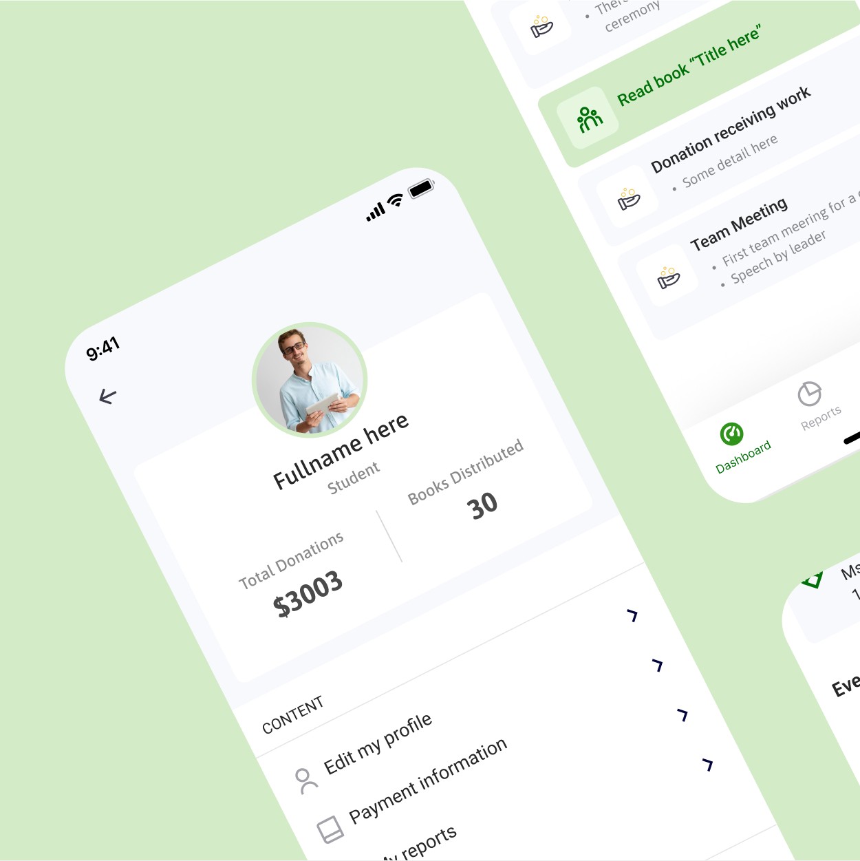
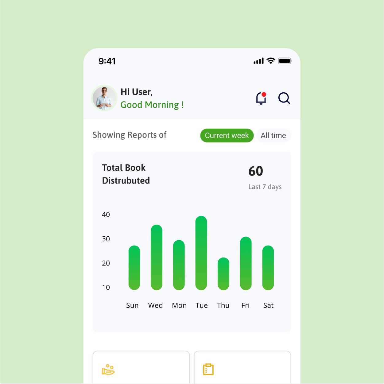
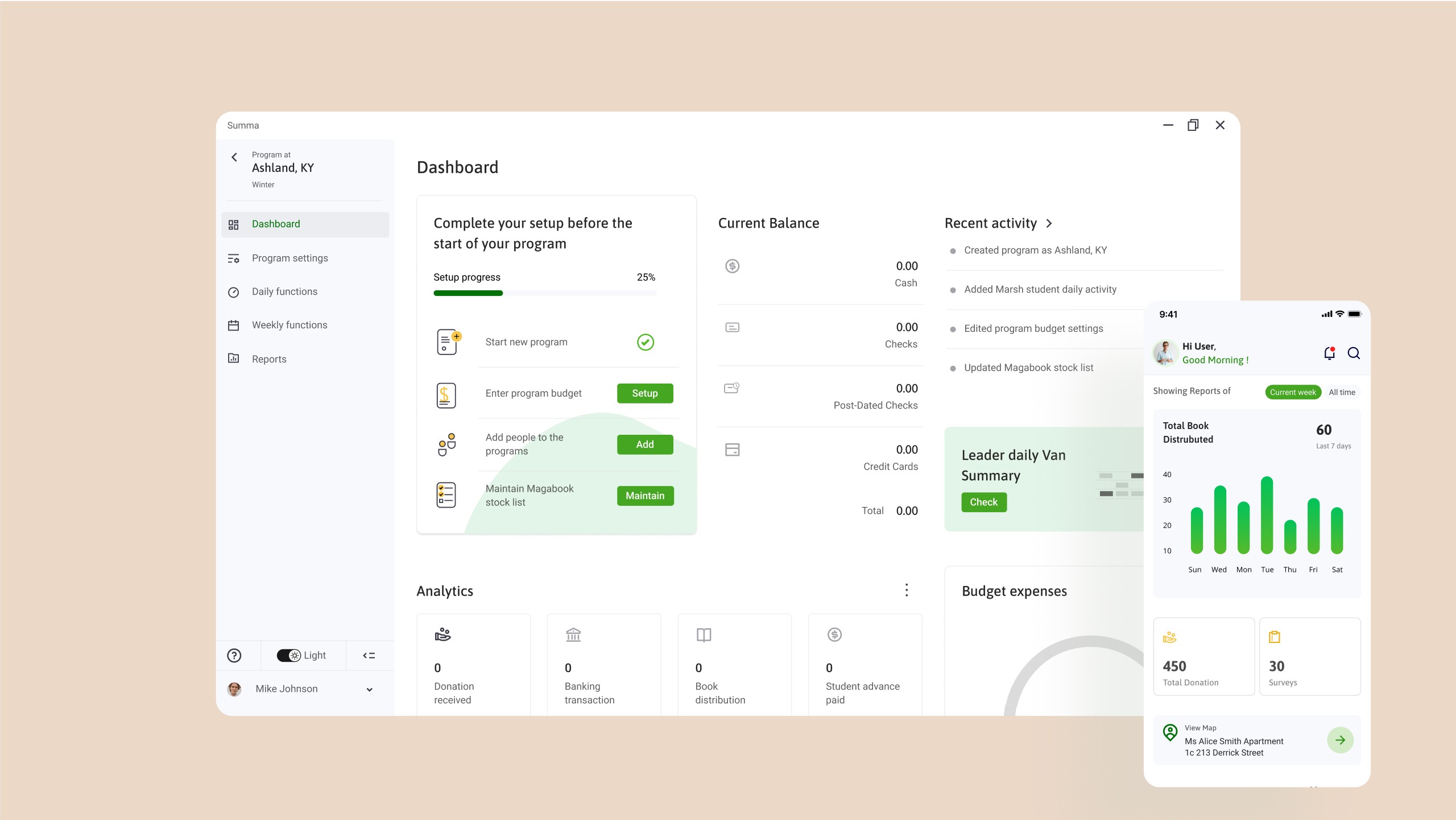
Desktop application
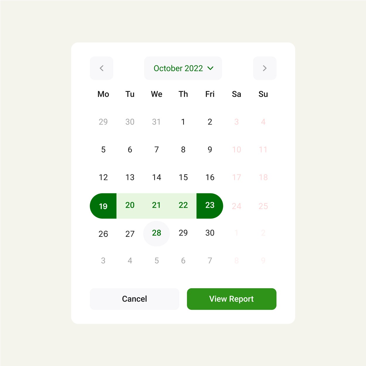
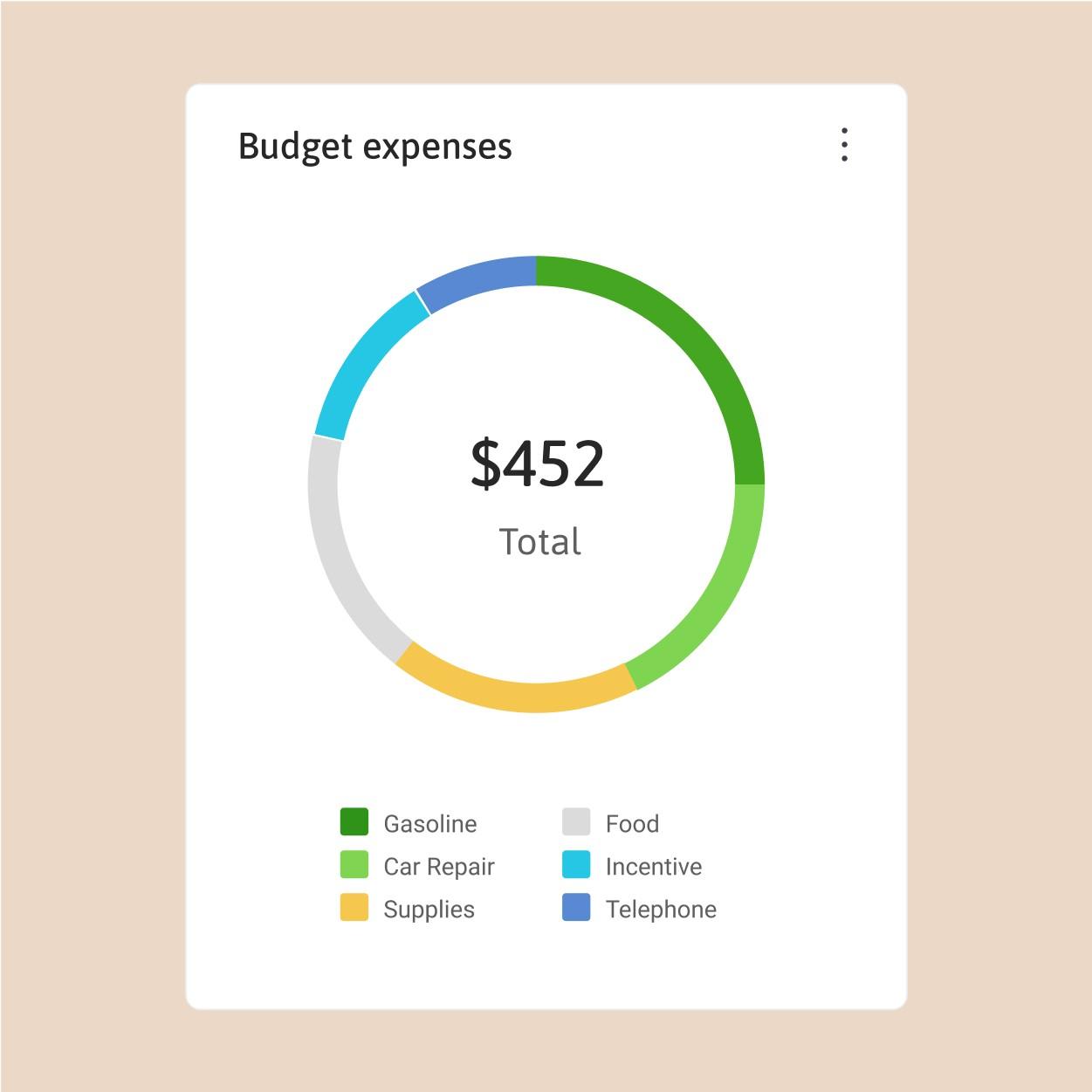
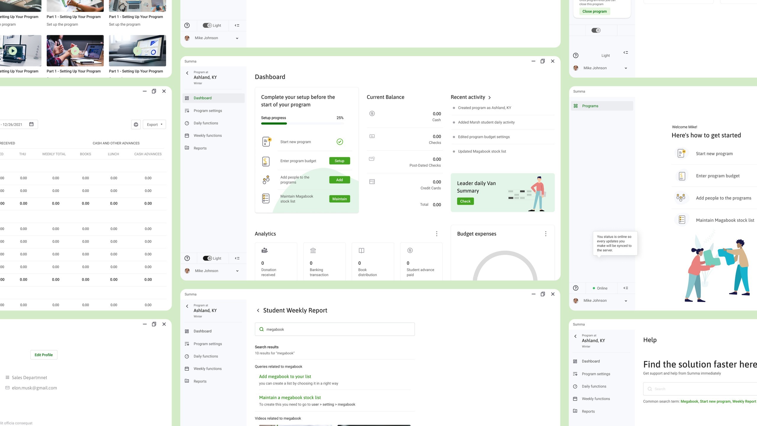
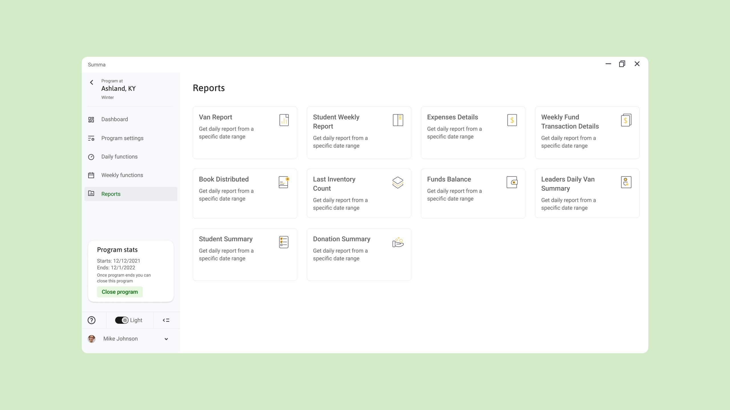
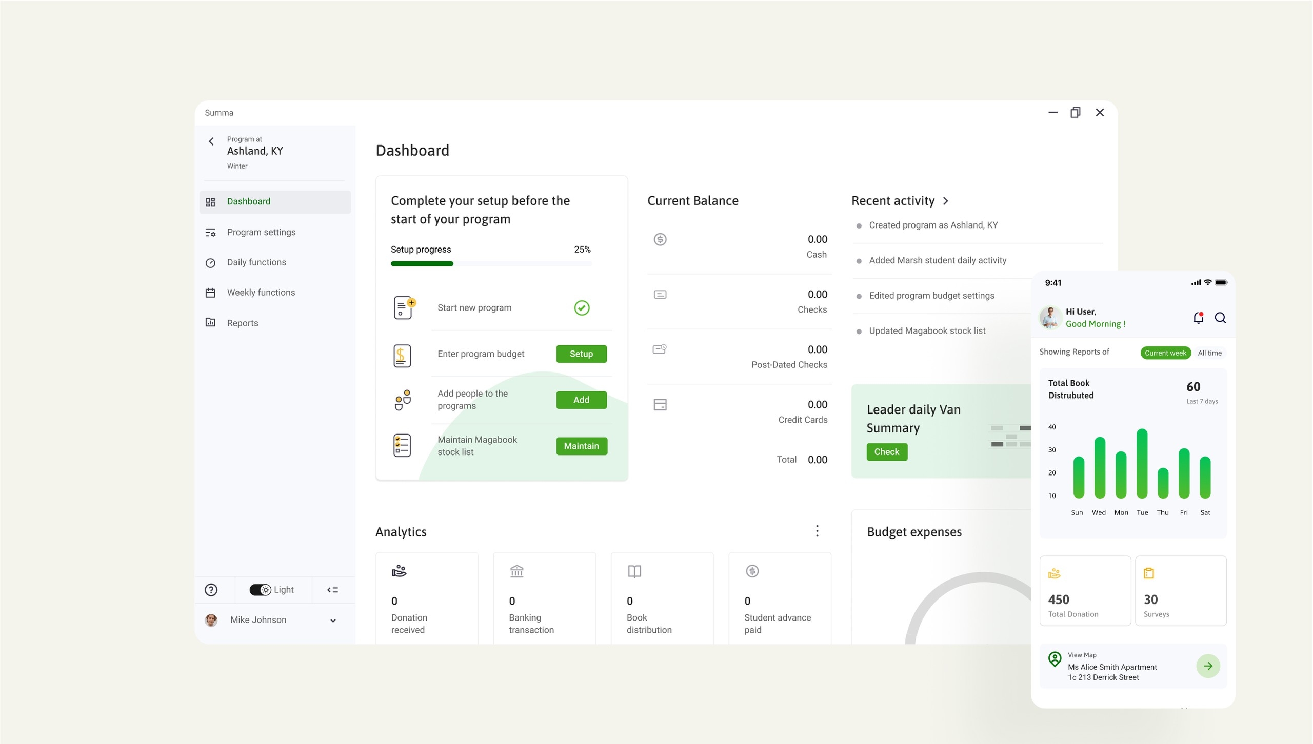
Our goal was to breathe new life into a complex application by giving it a fresh, modern, and minimalistic look. To achieve this, we employed data visualization techniques to make the interface more engaging and informative. We also designed a custom iconography set that aligns with the client's brand and serves as a subtle yet impactful visual element.
By incorporating these design elements, we aimed to create a visually appealing and user-friendly interface that not only looks great but also enhances the overall user experience. Due to its offline use feature we took care of many different states.
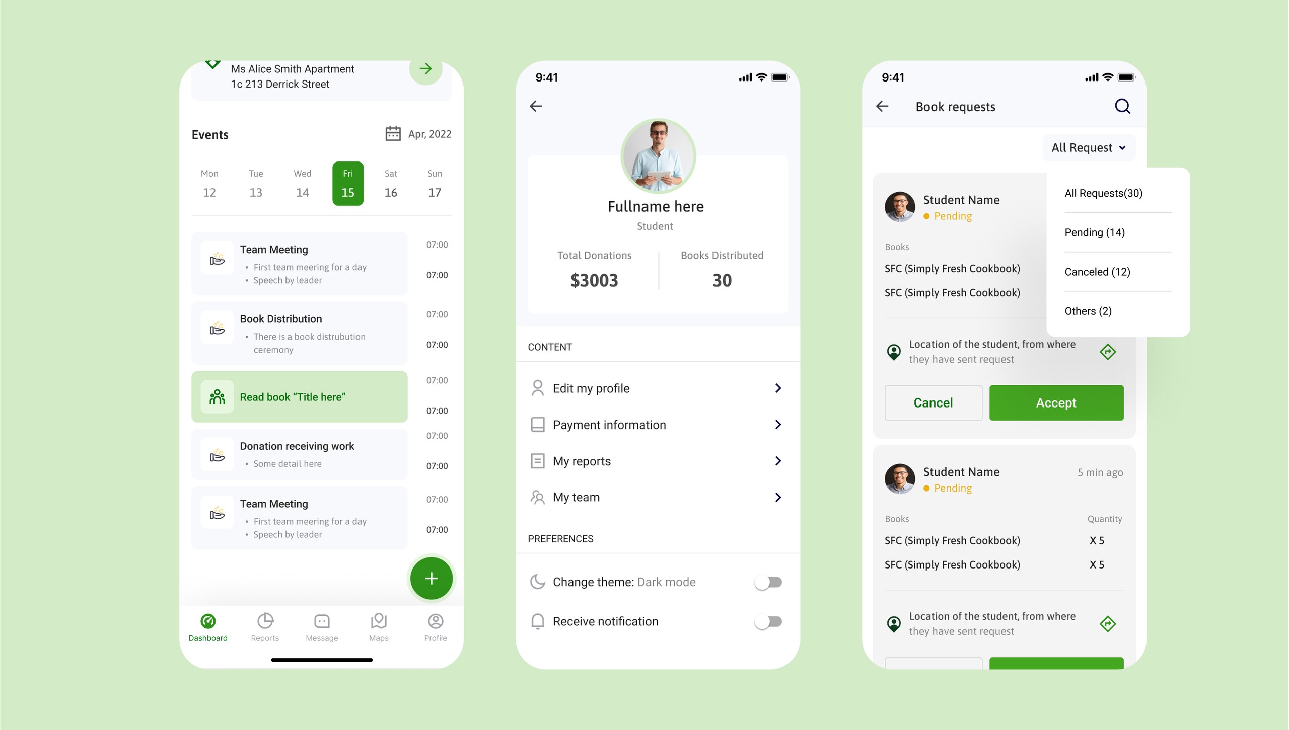
Mobile Application
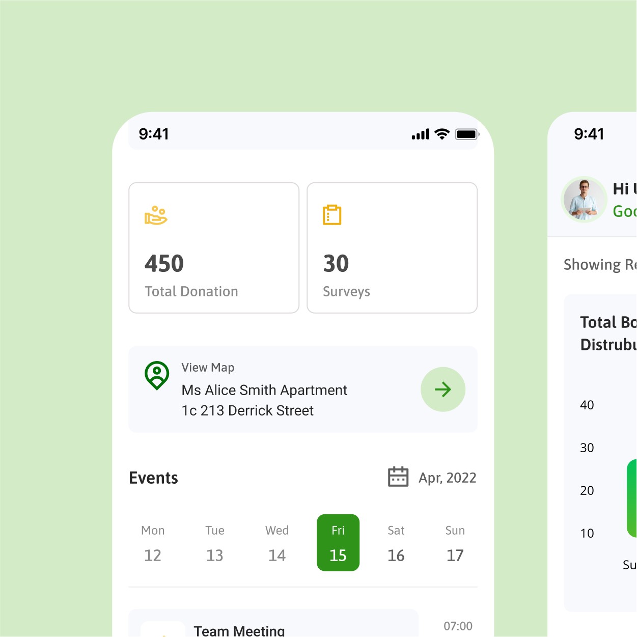
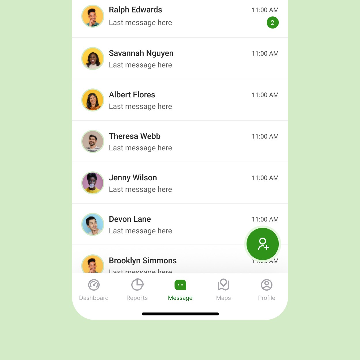
The application is developed in the one code base for all platform i.e. Flutter so we carefully created interface which goes both on the mobile and desktop.
