Brief
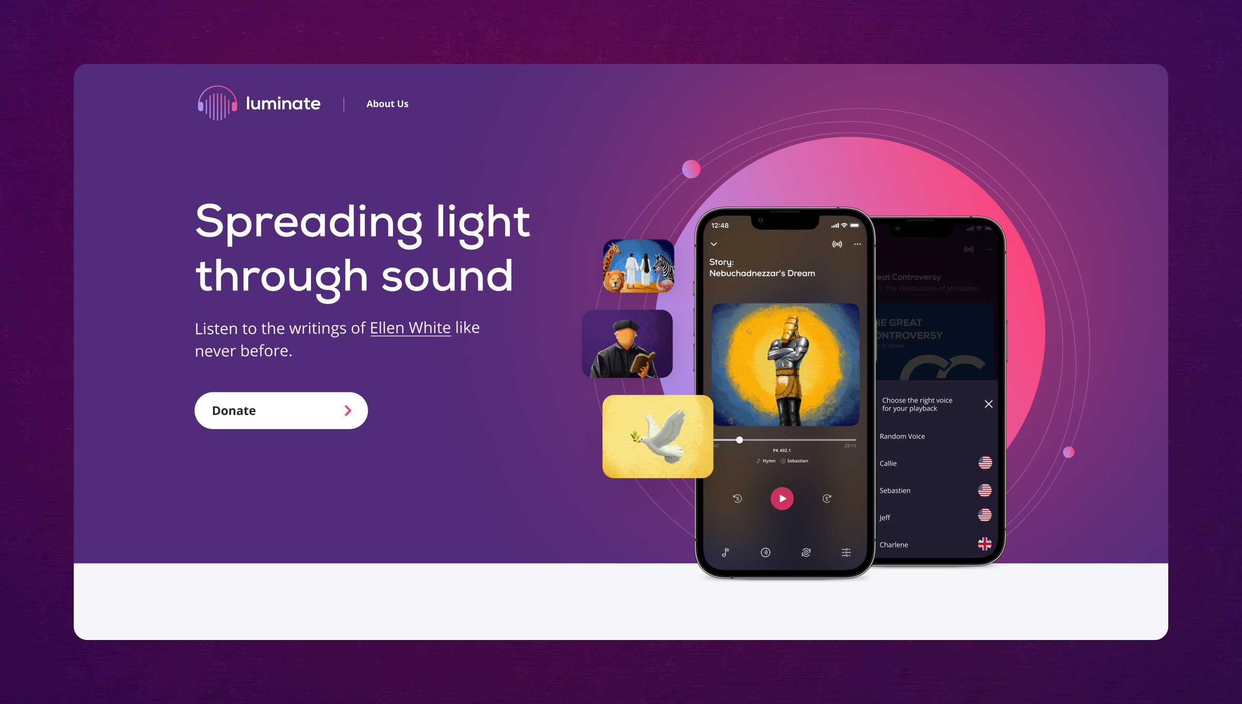
Luminate is an experience curated through customizable music and voice combinations to enhance the meditational listening experience. The application covers the writing of Ellen White, an American women author who rehearsed the bible scriptures. Luminate is designed to provide a memorable experience through voices and music that will lift our spirits. The idea behind Luminate is to give Ellen White’s writing the best audio experience and to create an audio experience worthy of her thoughts.
Challenge
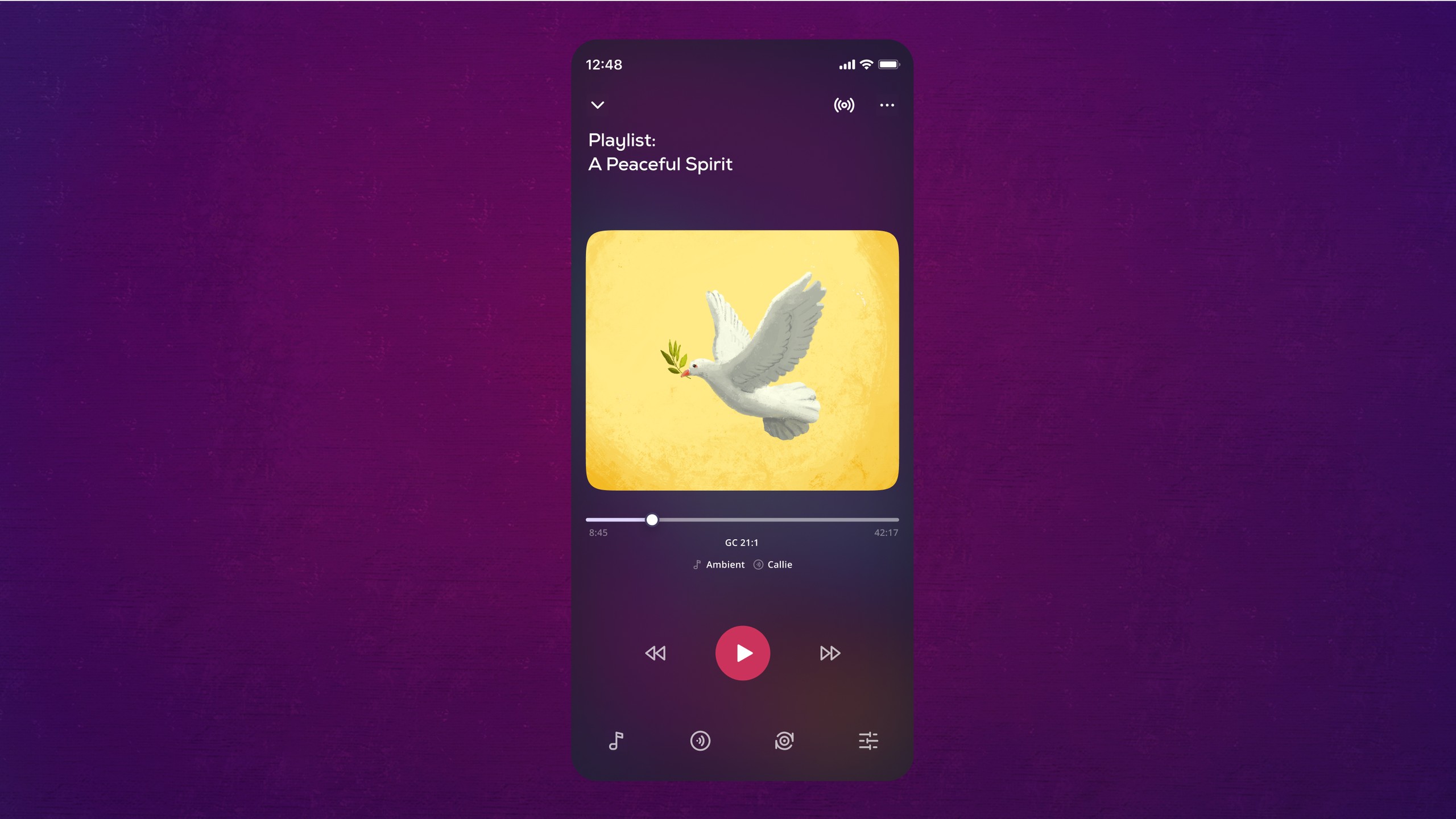
Nevertheless, Ellen G. White's books are too heavy and are not possible to carry around. And, while her writings are available as e-books and pdfs, finding time to read all of that lengthy content in our chaotic world can be difficult. But perhaps we can listen to them on a commute or while waiting in the airport, right? Yet, the audio experiences that are already available make this option either limited to one voice or accent that appeals to some but not all or just downright boring. Also, there is no engaging music to keep it more interesting because the majority of podcast listeners prefer subtle music in the background.
Stakeholder interviews
We strongly believe that understanding your stakeholders and their perspectives is key to your project’s success and is commonly done through stakeholder interviews. Our UX team members asked the stakeholders all the relevant questions that were meant to shape the design process, define success metrics, and ultimately meet their expectations.
Creating a unique brand identity
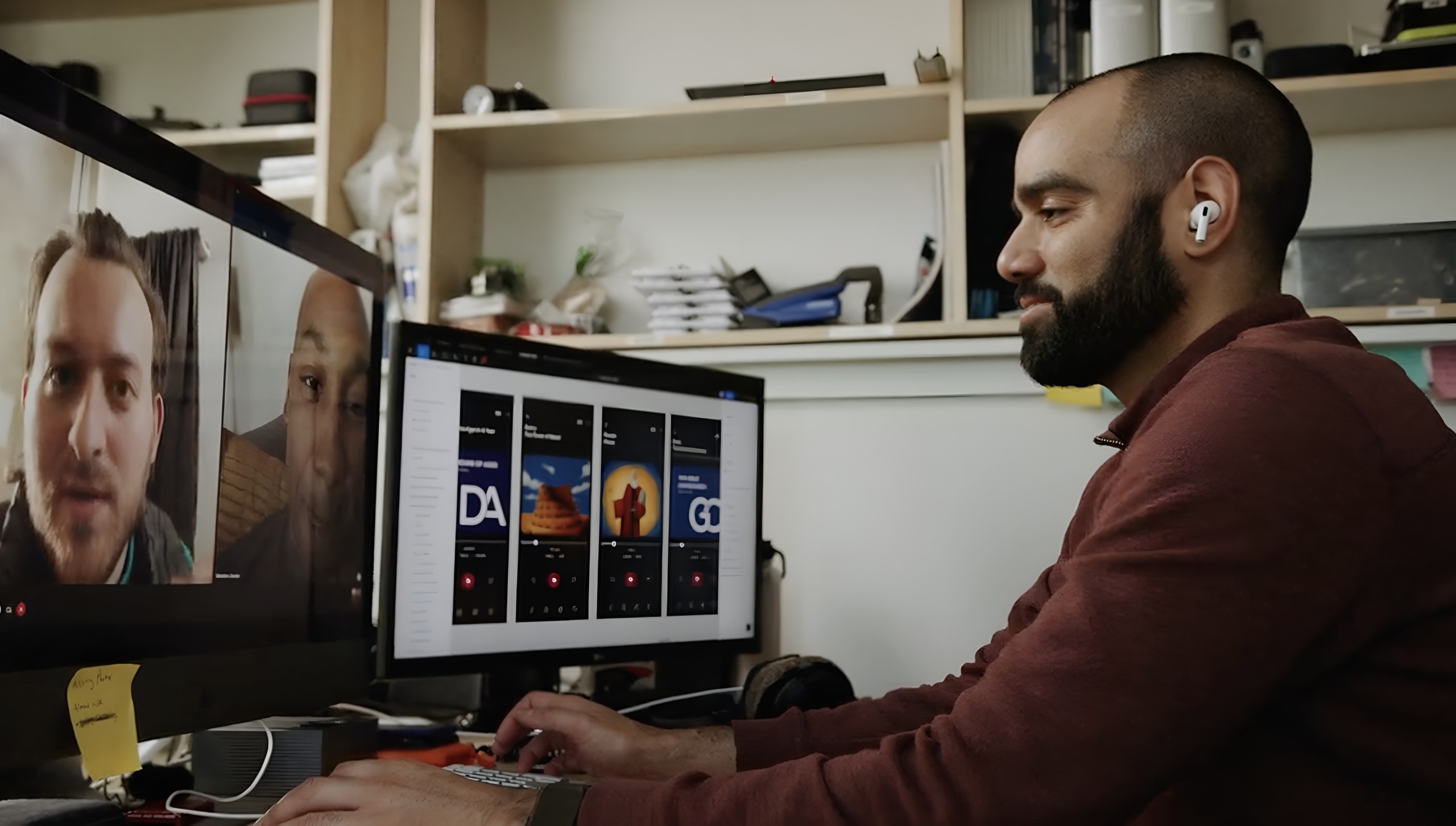
The main objective was to create a feeling of trust and achieve a better audio experience. Visual identity systems help businesses solve problems. Our key objectives for the branding were:
- Support Luminates' mission through its visual identity.
- Gain the trust of completely new users.
- Make sure our brand identity is unique.
- Create adequate, unique, pleasant, and easy-to-blend elements.
- Reduce costs and save time for future product launches.
- Prepare product assets (illustration, web, mobile, print, and physical) for a wide range of usages.
User research ( Researching with empathy in mind)
When we planned to conduct our user research, we tried to have a mix of both qualitative and quantitative data to draw from to avoid stumbling upon any issues from the value-action gap, which can at times make qualitative data unreliable. We decided to take our users' perspectives into consideration. As user researchers, we try to set up the right questions and get unbiased answers from your users via remote online interviews and more.

Wireframings
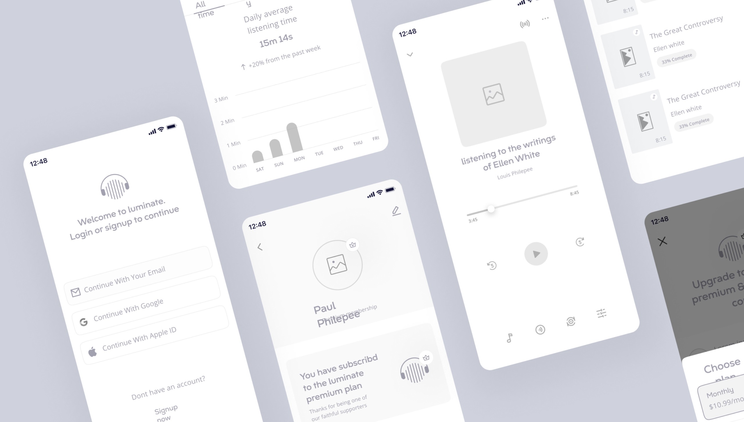
Wireframing helped us to draw overviews of interactive products to establish the structure and flow of possible design solutions. The wireframes reflected the outline of user and business needs. We did a lot of paper wireframes at first and used the software-rendered wireframes to help teams and stakeholders ideate toward optimal, user-focused multiple prototypes and overall app design.
High fidelity prototypes
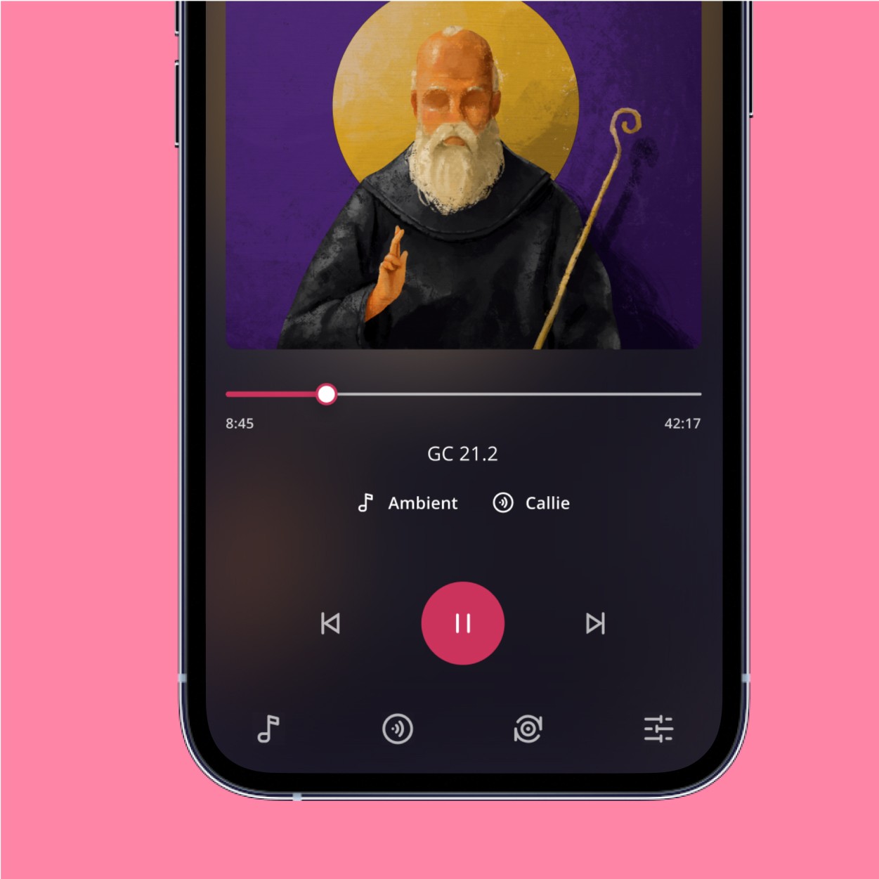
We created a Hi Fi prototype to provide the most accurate visuals for the final design in terms of details and functionality. It included the design's style and visuals for the user interface. This prototype was used for capturing data on actual human performance, such as finishing a task for usability testing and conducting accessibility testing.
Dark theme first
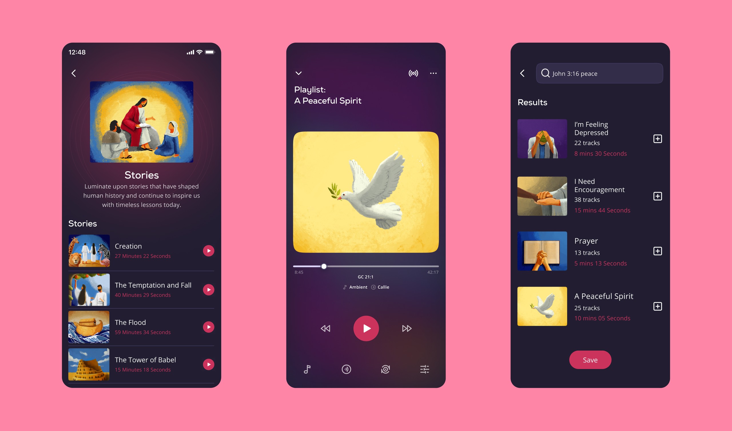
We studied extensively before opting for a lower color choice, considering brand fit, cultural compatibility, and color psychology, as well as the emotional impact. Also from our use research, it came to know that the majority of user groups are using devotional content during evening or early in the morning so dark mode was a good solution for consuming less energy and keeping the ambiance mode of the whole application. Also, light text on a dark background is easier to read on the screen.

$156k funding from KickStarter
Yes, we made it! We successfully raised $156K in funding from the KickStarted Campaign. We are moving ahead to provide the best listening experience.
