Brief
Chronotek is a cloud-based time tracking & schedule system for any business with remote employees. They are helping businesses to manage their most valuable resource— employees’ time. It is designed to free businesses from time card hassles and missed jobs through scheduling, no-show alerts, and mobile views, giving companies time to build their business, to spend time with their families, and enjoy a higher quality of life.
Challenge
Chronotek's current mobile app user experience is outdated and requires improvement to better serve its diverse user base of varying ages. As a result, our team was tasked with the responsibility of redesigning and rebranding the app to better serve its million users. To meet this challenge, we took great care in crafting each page of the app, ensuring that our work aligned with the client's vision through consistent communication.
Discover
Every brainstorming and ideation workshop included stakeholders. This ensured that the users' needs were met without interruption. Our team thought that creating personas was a powerful and versatile technique for gathering insights, as well as a great way to synthesize user research. We analyzed the competition by conducting research and learning about what best suited our project. This aided us in developing the website that gained popularity among users.
Rebranding
To coincide with the launch of the new app, Chronotek made the decision to rebrand its logo and overall brand identity. The old logo presented several issues, including problems with the color, typography, and logo mark. The outdated logo mark was complicated and posed challenges in digital media, as it did not translate well across various platforms. Although the old logo mark incorporated time and location, it was not executed effectively, which hindered the overall impact.To address these issues, we designed a new logomark that remains consistent with the company's focus on time and location but is executed in a more minimalistic and visually appealing way. The modernized design presents a fresh, streamlined look that will resonate with users and create a more memorable brand identity.
.jpg&w=3840&q=100)
.jpg&w=3840&q=75)
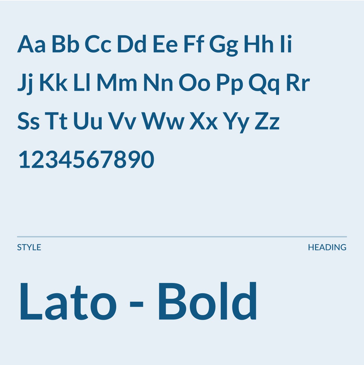
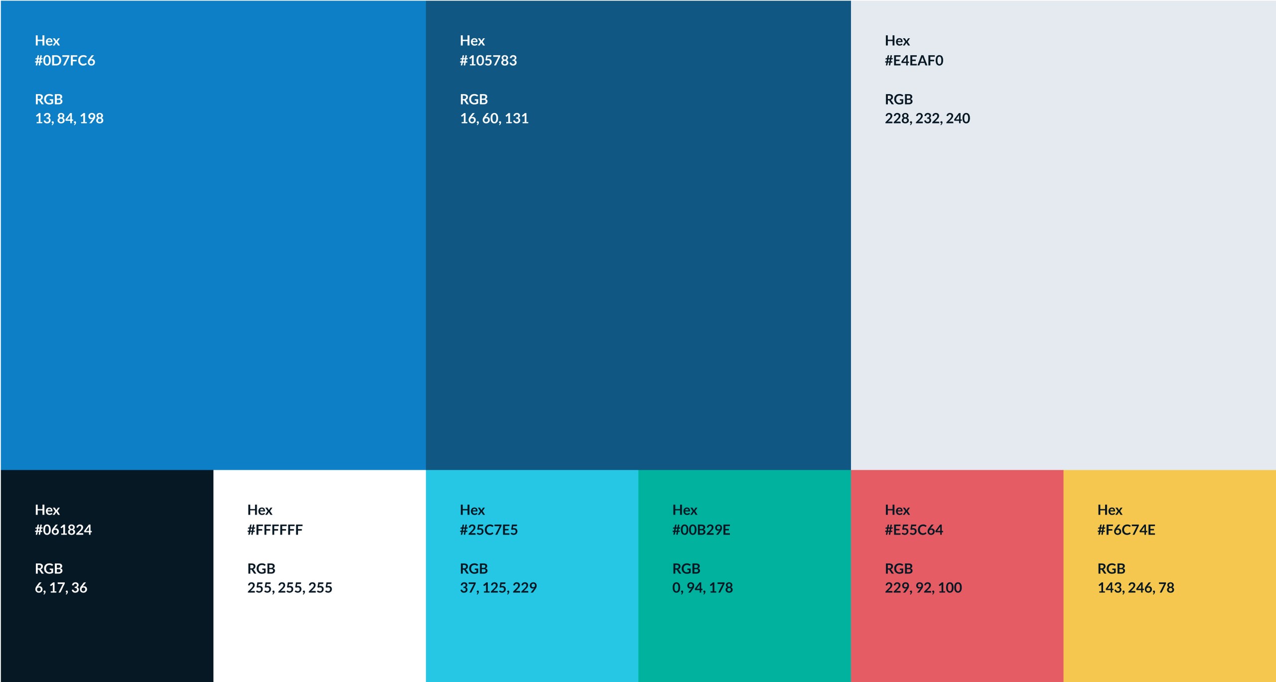
Color
As the app is intended for daily use, we chose to incorporate subtle, saturated colors into the new branding to create a softer and more visually pleasing experience. The old branding incorporated colors that were overly saturated and did not create an optimal visual experience for users. By utilizing a more subdued color palette, we aimed to create a calming and inviting environment for users that would enhance the overall usability and appeal of the app.
Everything was created with love
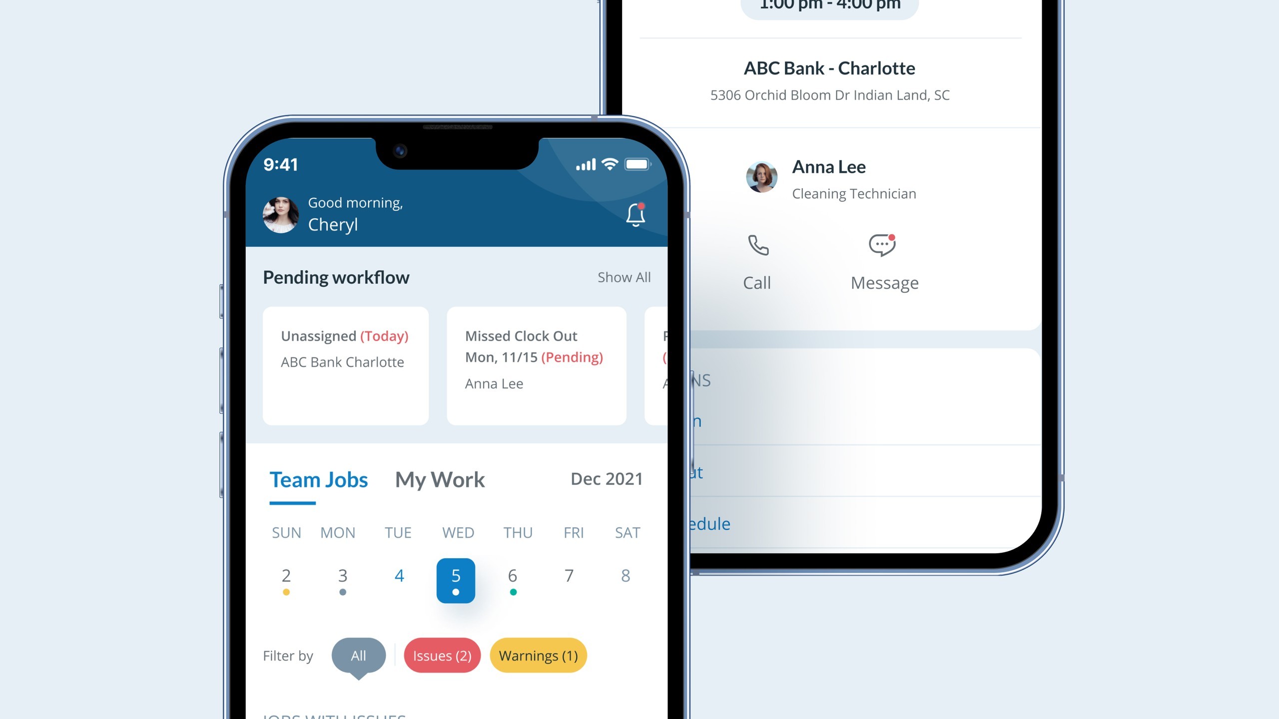
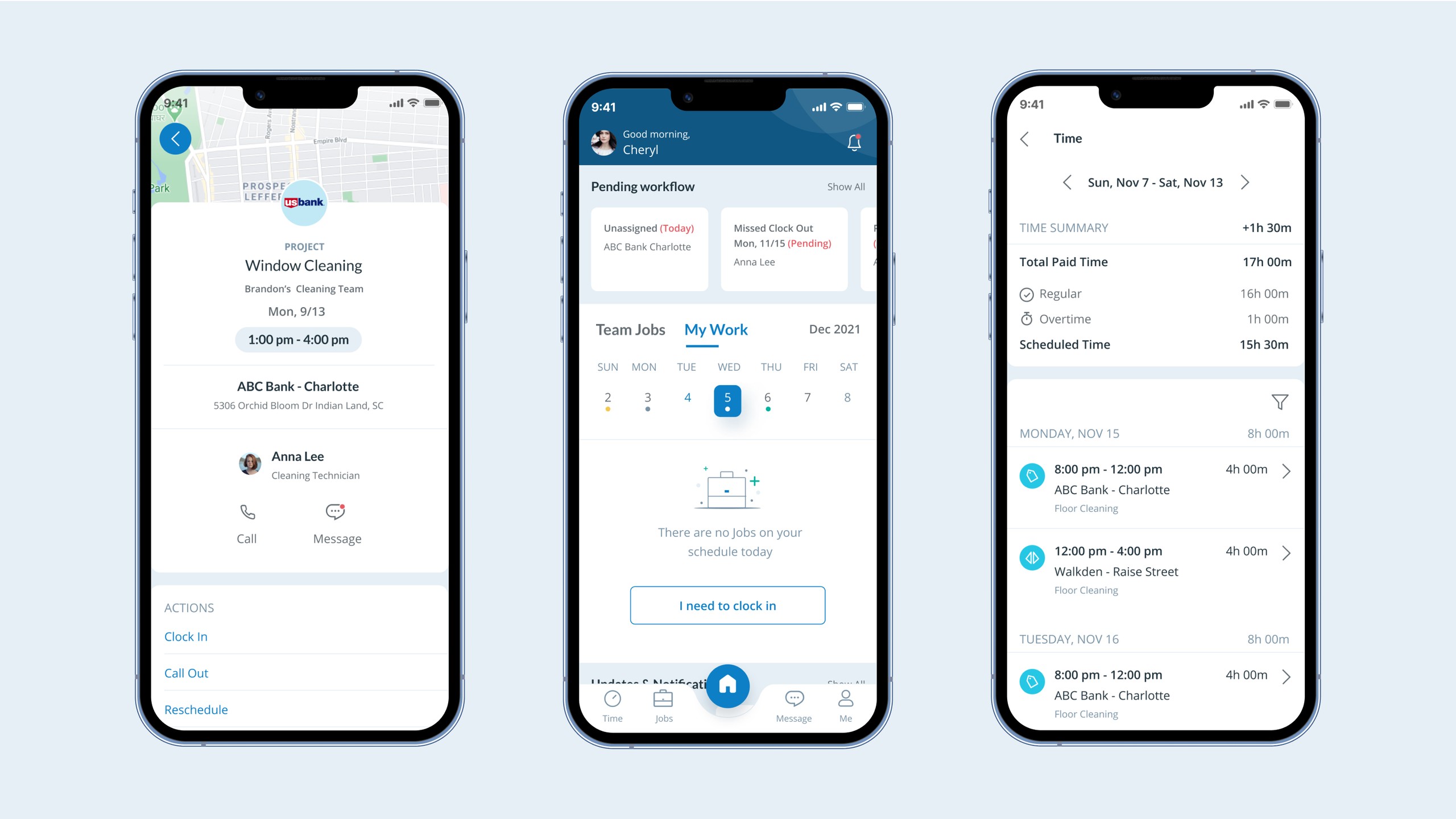
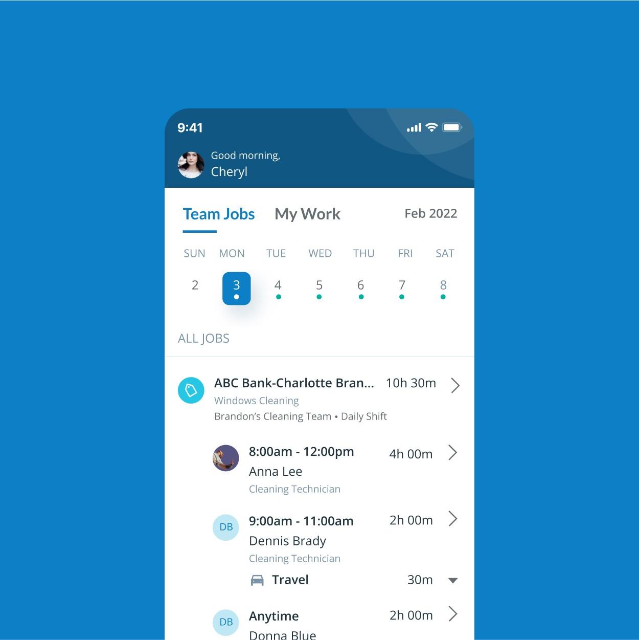
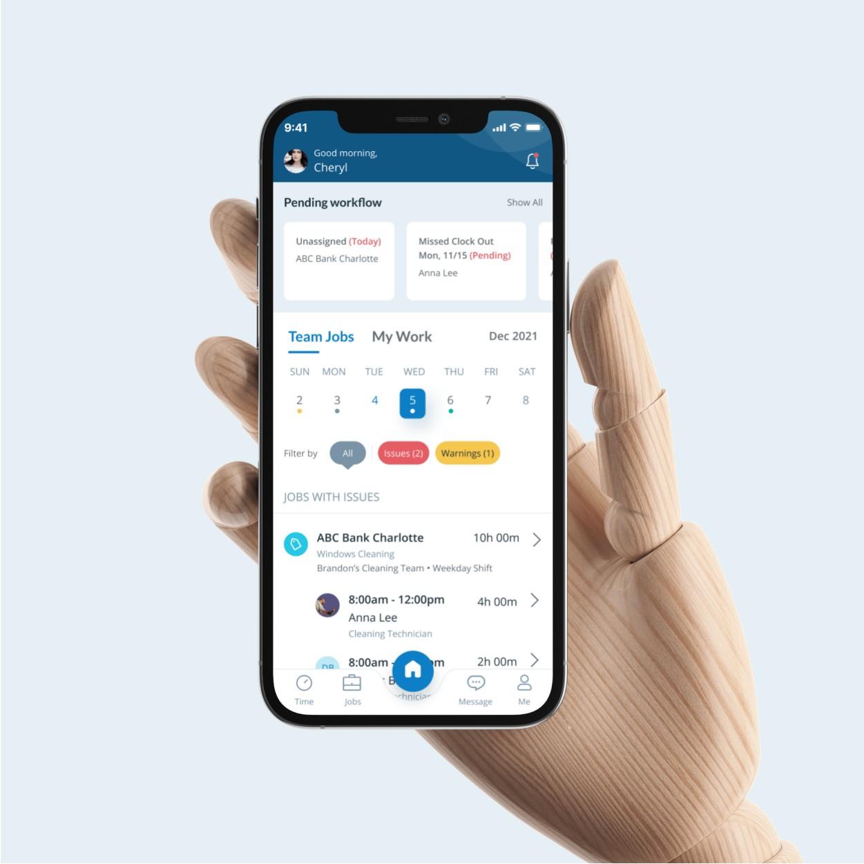
Our objective was to create a minimalistic and clean design that was user-friendly and easy to navigate, catering to both novice and experienced users. We prioritized simplicity and ease of use to ensure that the application was accessible to all, regardless of their level of experience. Our goal was to provide a seamless and intuitive user experience, making it effortless for users to engage with the app. In addition to our other design considerations, we placed a strong emphasis on accessibility in order to ensure an inclusive user experience. We aimed to create a design that would accommodate a diverse range of users, including those with disabilities or impairments.