Brief
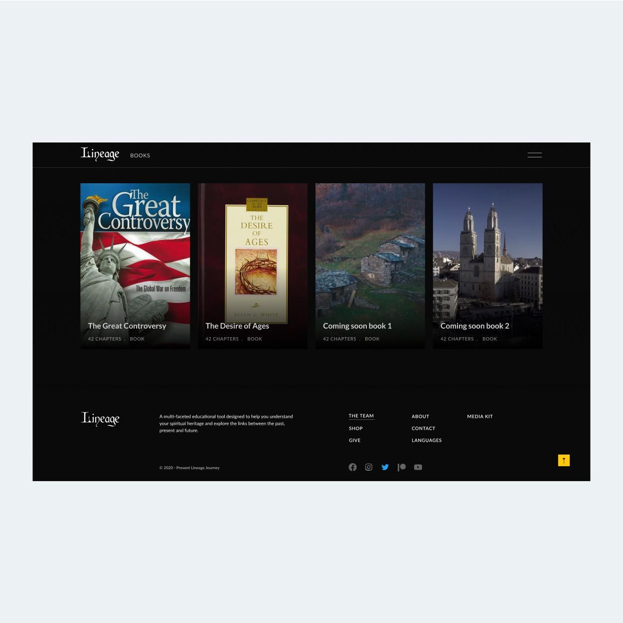
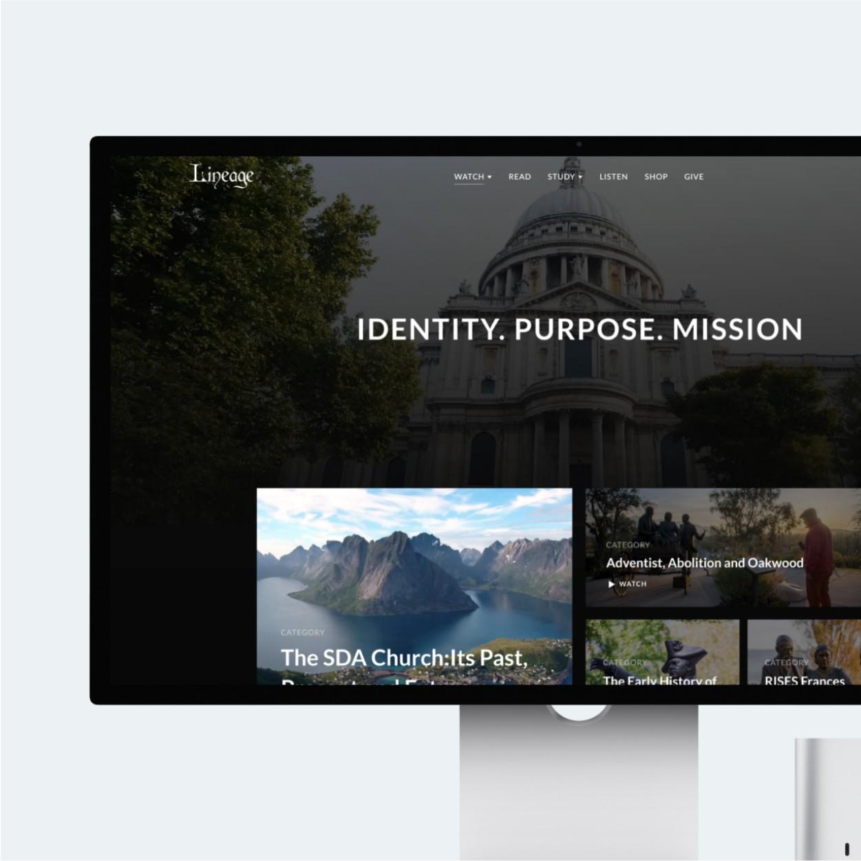
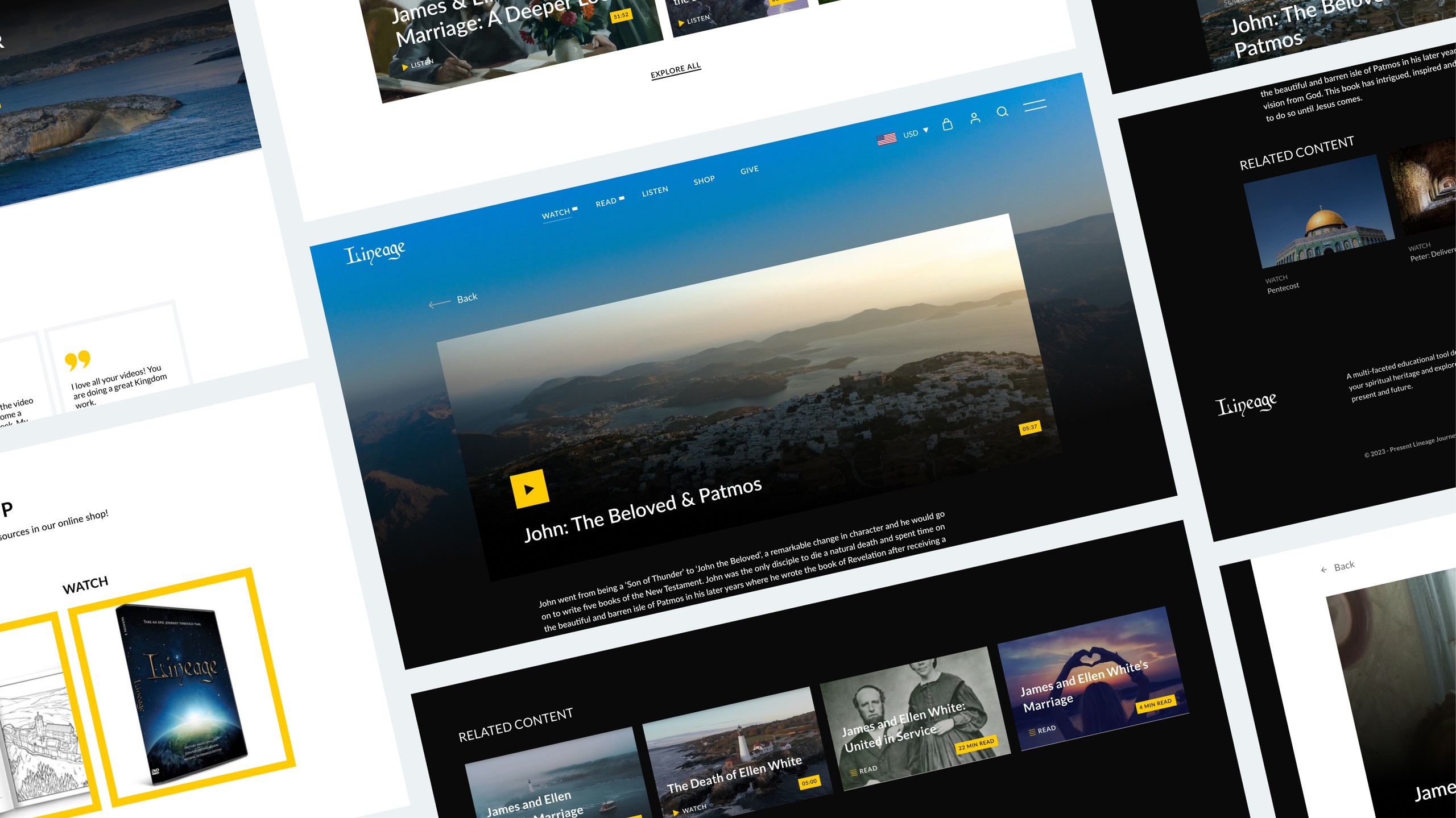
A many-sided educational tool designed to help you understand your spiritual heritage and explore the connections between the past, present, and future. Lineage is a ministry geared towards producing multipurpose educational resources that aim to make history both relevant and accessible to people of all ages.
Challenge
Previous Lineage Journey was a complicated and traditional design, so our mission was to redesign a website that would enhance the user experience and that would let us expand our business to a larger audience. As a kind of thing on its own, building brand awareness was also one of the top challenges for Lineage Journey. Establishing and maintaining trust with the user is always a critical component for long-term success. As a result, our team had to come up with a minimal website that conveyed Lineage Journey’s value proposition and brand identity. Based on this information and various user flows, we were able to resolve the challenges in the new website design. The major reason of redesign are:
- Lackluster user experience
- Difficulty expanding business to a larger audience
- Complicated and traditional design
Discover
Every brainstorming and ideation workshop included stakeholders. This ensured that the users' needs were met without interruption. Our team thought that creating personas was a powerful and versatile technique for gathering insights, as well as a great way to synthesize user research. We analyzed the competition by conducting research and learning about what best suited our project. This aided us in developing the website that gained popularity among users.
Define
To coincide with the launch of the new app, Chronotek made the decision to rebrand its logo and overall brand identity. The old logo presented several issues, including problems with the color, typography, and logo mark. The outdated logo mark was complicated and posed challenges in digital media, as it did not translate well across various platforms. Although the old logo mark incorporated time and location, it was not executed effectively, which hindered the overall impact. To address these issues, we designed a new logomark that remains consistent with the company's focus on time and location but is executed in a more minimalistic and visually appealing way. The modernized design presents a fresh, streamlined look that will resonate with users and create a more memorable brand identity.

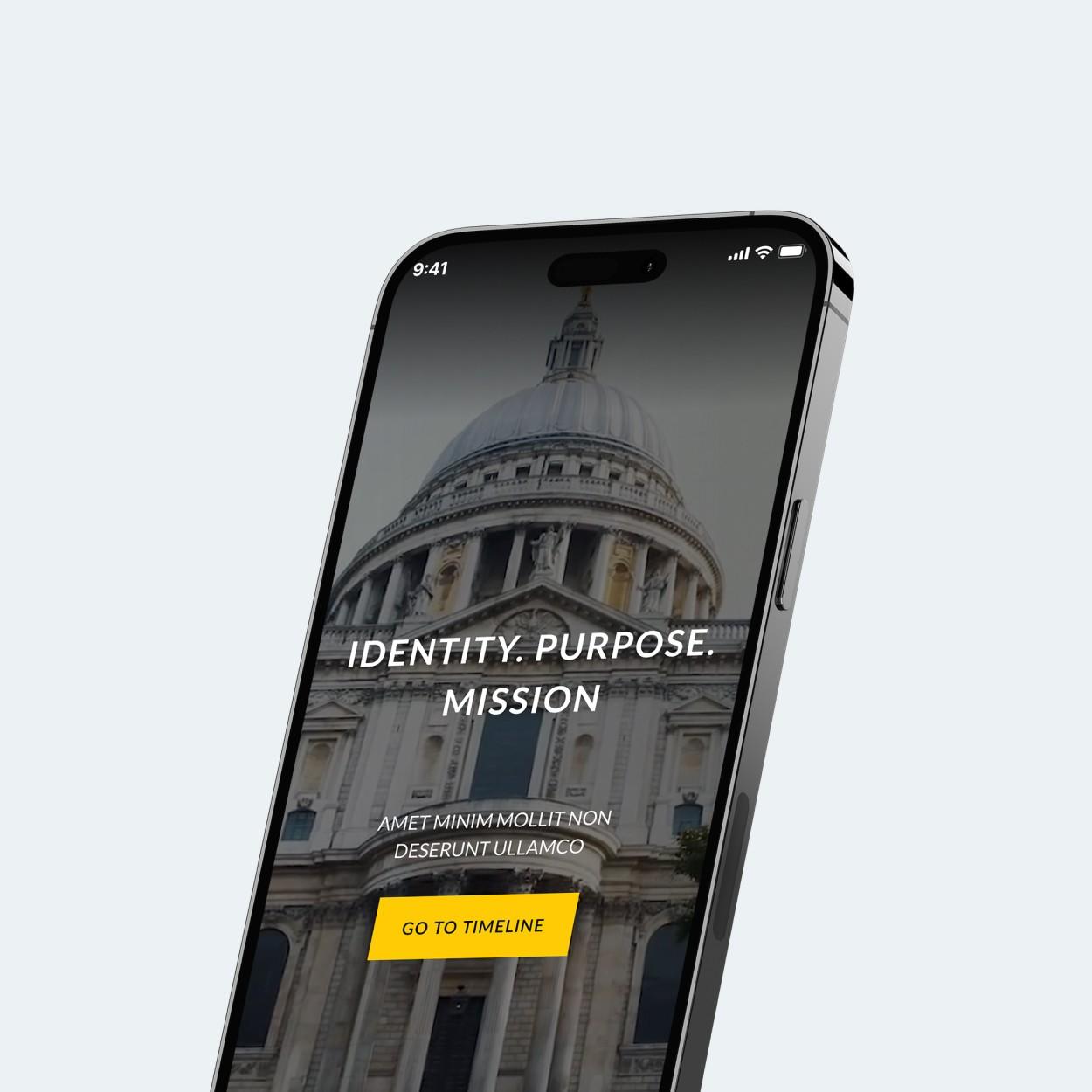
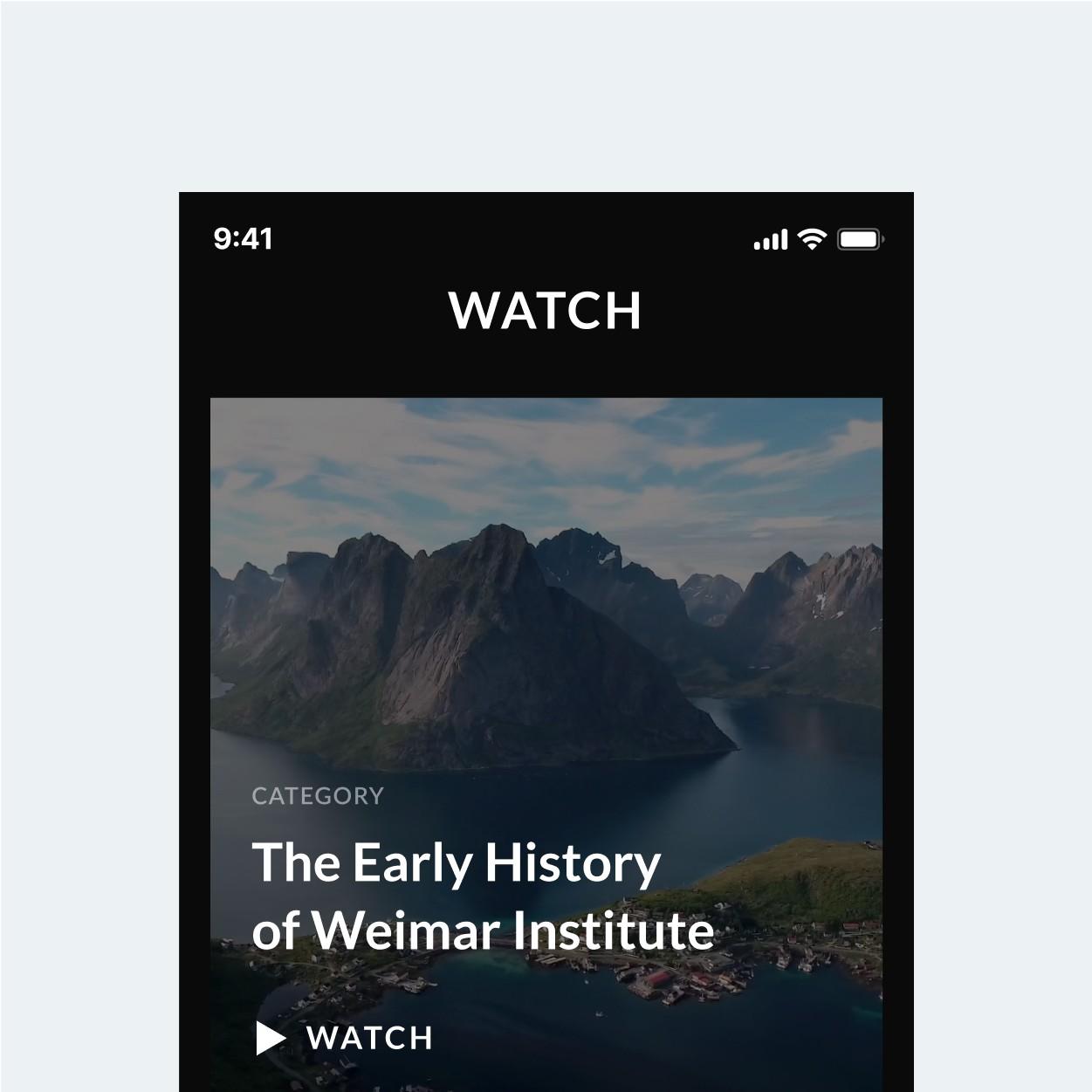
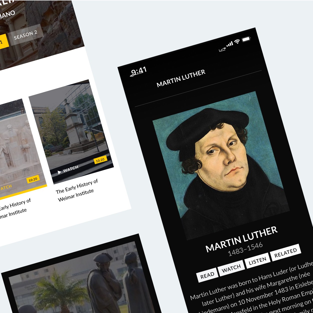
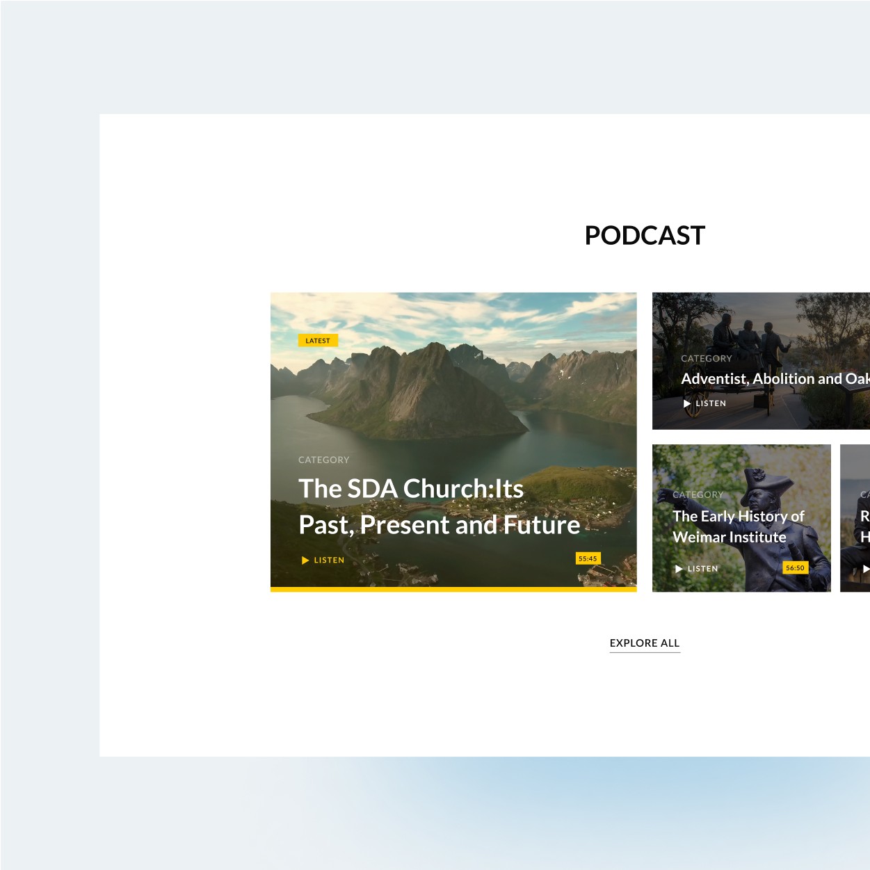
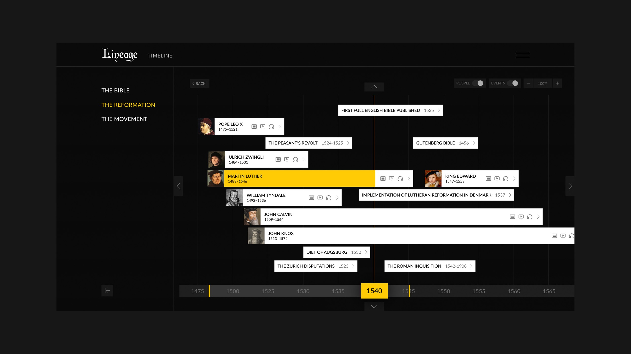
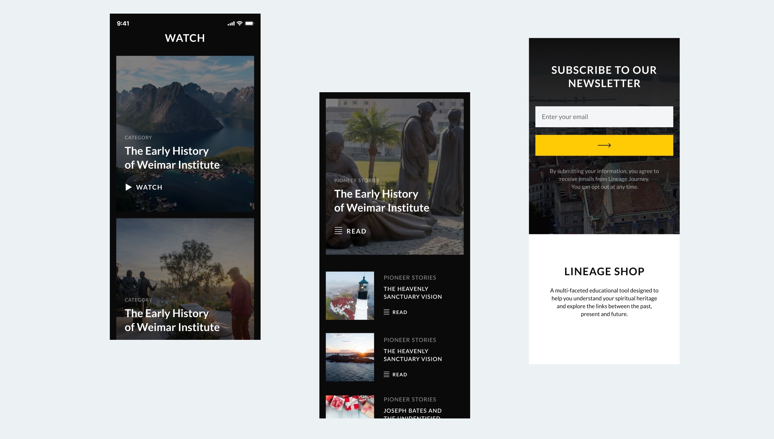
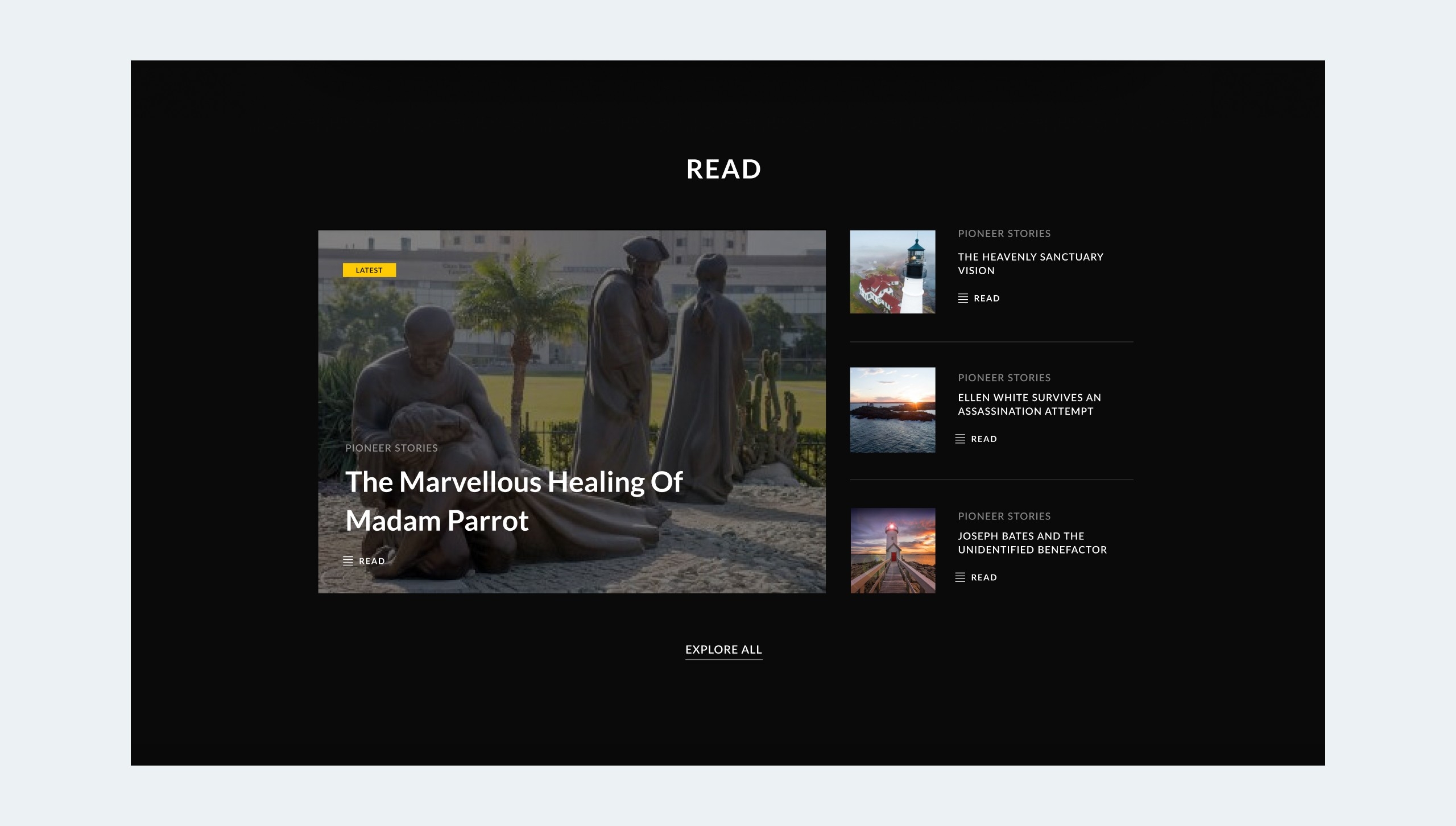
Design
The designs imply the intrinsic values of lineage, which are dynamic and progressive. Overall, the visual design is created from the perspective of building trust among customers, reducing drop-off rates, and increasing revenue. The website is very simple, which conveys the value proposition offered and helps customers with easy and convenient navigation. We carefully crafted content for each page to build trust and credibility and convince new users to try the courses available. The dynamic yet flexible screens are designed to convey the benefits and allow the platform to be scalable and simplified to improve the experience of the users. We crafted simple and user-friendly interfaces to provide a better solution.